Slaughterhouse-Five
In casting three actors to play Billy Pilgrim, [Adapter and Director] Josh Aaseng wanted to emphasize the fractured nature of a mind post-war, post-trauma. And Josh and I decided early on that we wanted to honor that idea in the poster, as well. Three featured actors (Robert Bergin, Todd Jefferson Moore, and Erik Gratton), spliced together somehow.
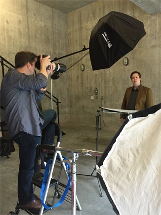
John Ulman took the photos and the show’s costume designer, Pete Rush, provided the wardrobe, which was just the right amount of period appropriateness without being too costume-y.
I wanted to have a whole range of angles to choose from, and what resulted are almost like mugshots. Beautiful, expressive mugshots of Robert, Erik, and Todd (who were all good sports, posing in a cold garage).
John’s a great headshot photographer. An actor himself, he understands expressions really well and knows how to ask actors for small, but important adjustments.
Putting it all together was really fun. All those wonderful expressions, it was hard to choose, but I ended up settling on a central focus of Todd’s upward gaze. He sees something that the other two Billys don’t. The poster is on a blank, white background. I’ve never done that before. Book-It’s never done that before. (I don’t think.) But the bleakness seemed right for Slaughterhouse. Kind of spacey, too.
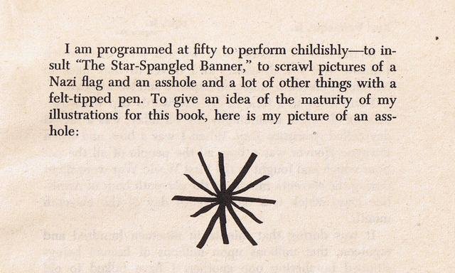
To dirty it up a little, I layered in a concrete texture, and the final addition to the poster was that asterisk next to Vonnegut’s name. I was reading about Vonnegut and I came across one of his illustrations from the foreword of Breakfast of Champions. A crudely drawn asterisk that represents…um, something else.
Irreverent and the right amount of weird. I loved it. It’s not a Slaughterhouse reference, but there would be extra meaning there for the diehard Vonnegut fans, and besides, not everything on a poster needs to make perfect sense.


